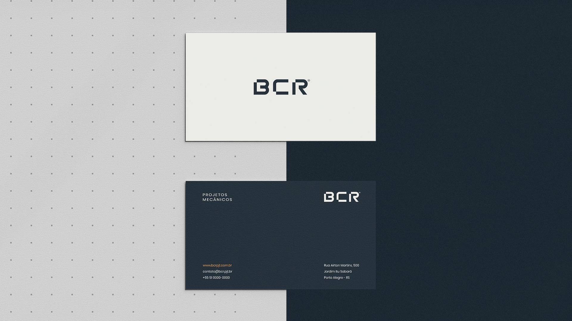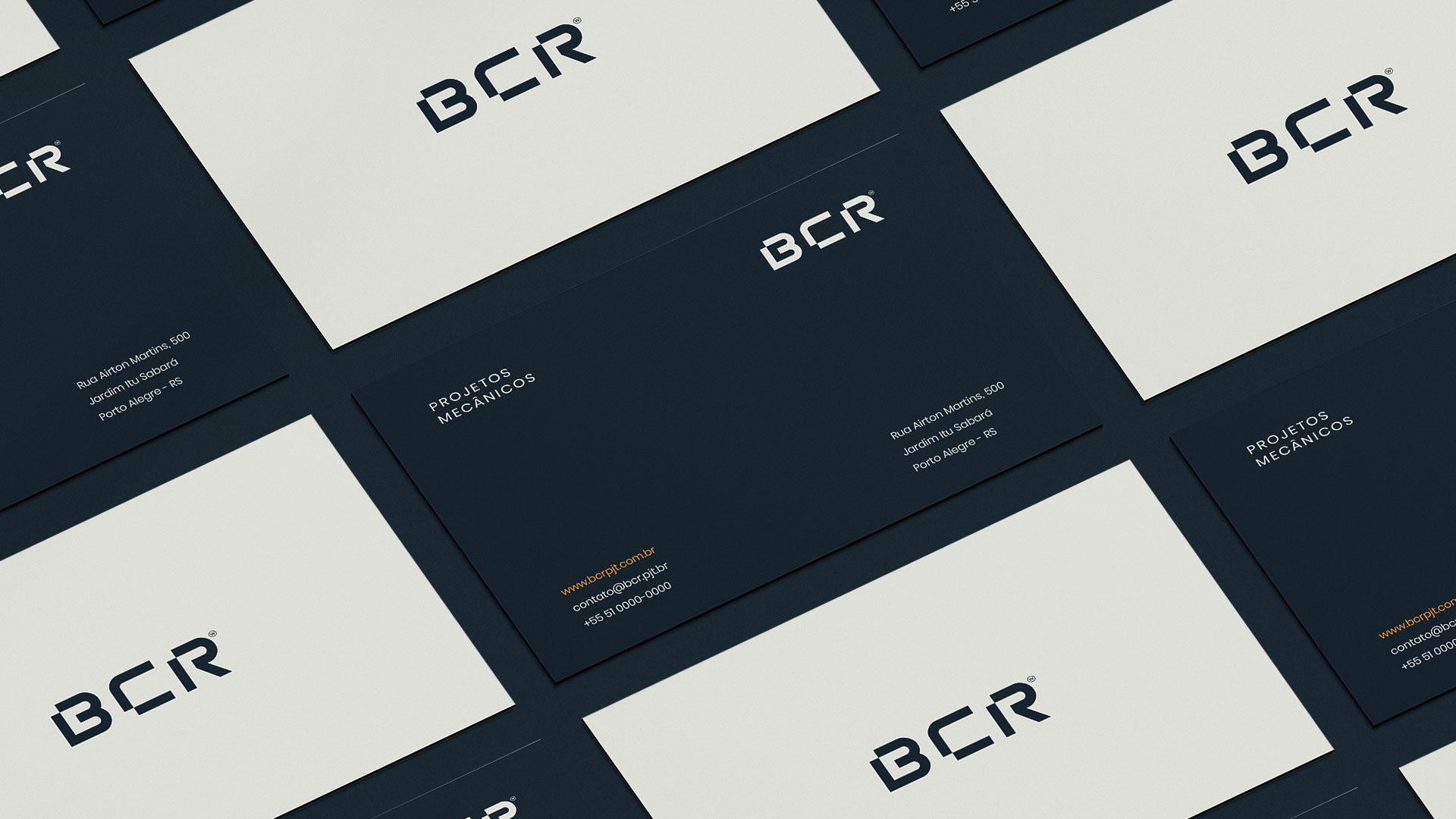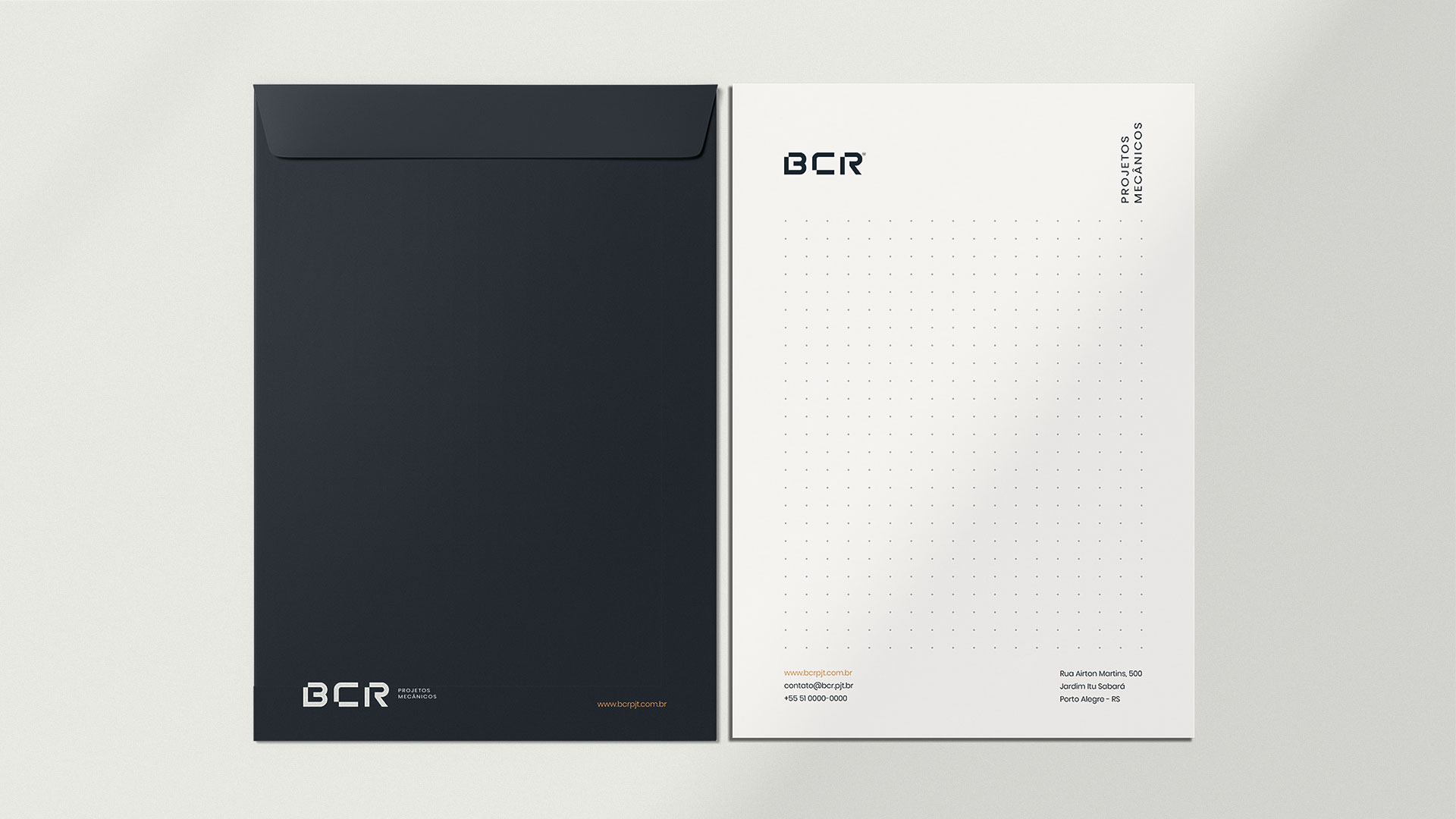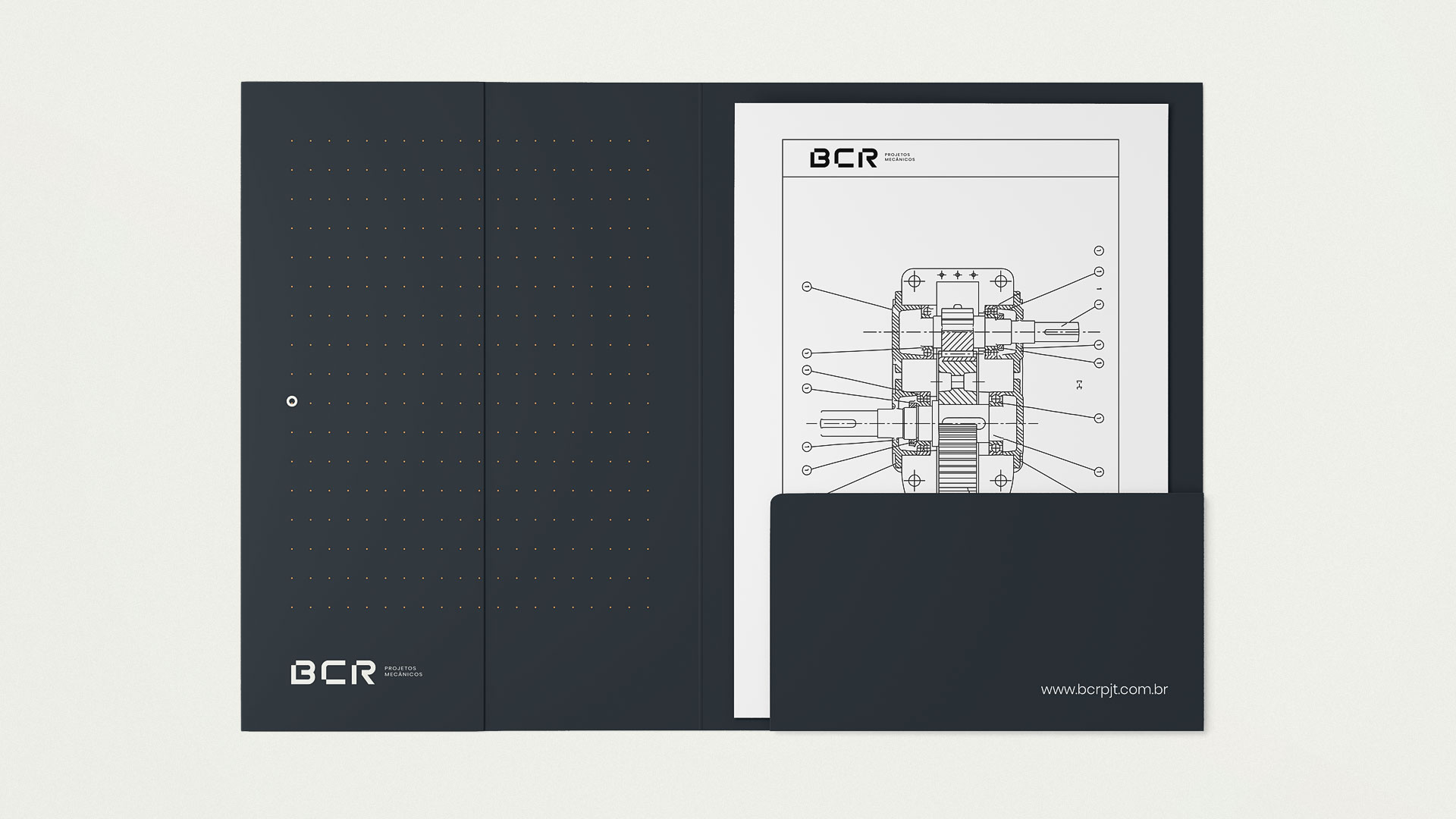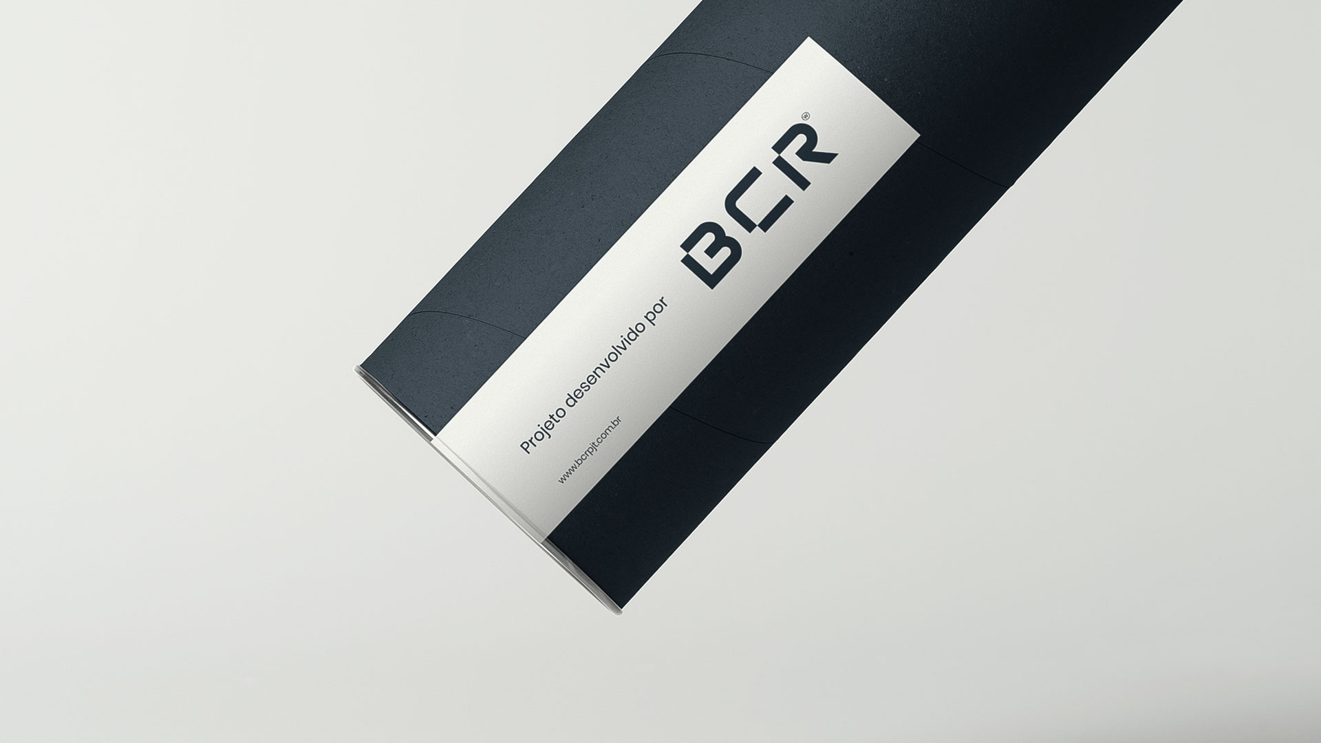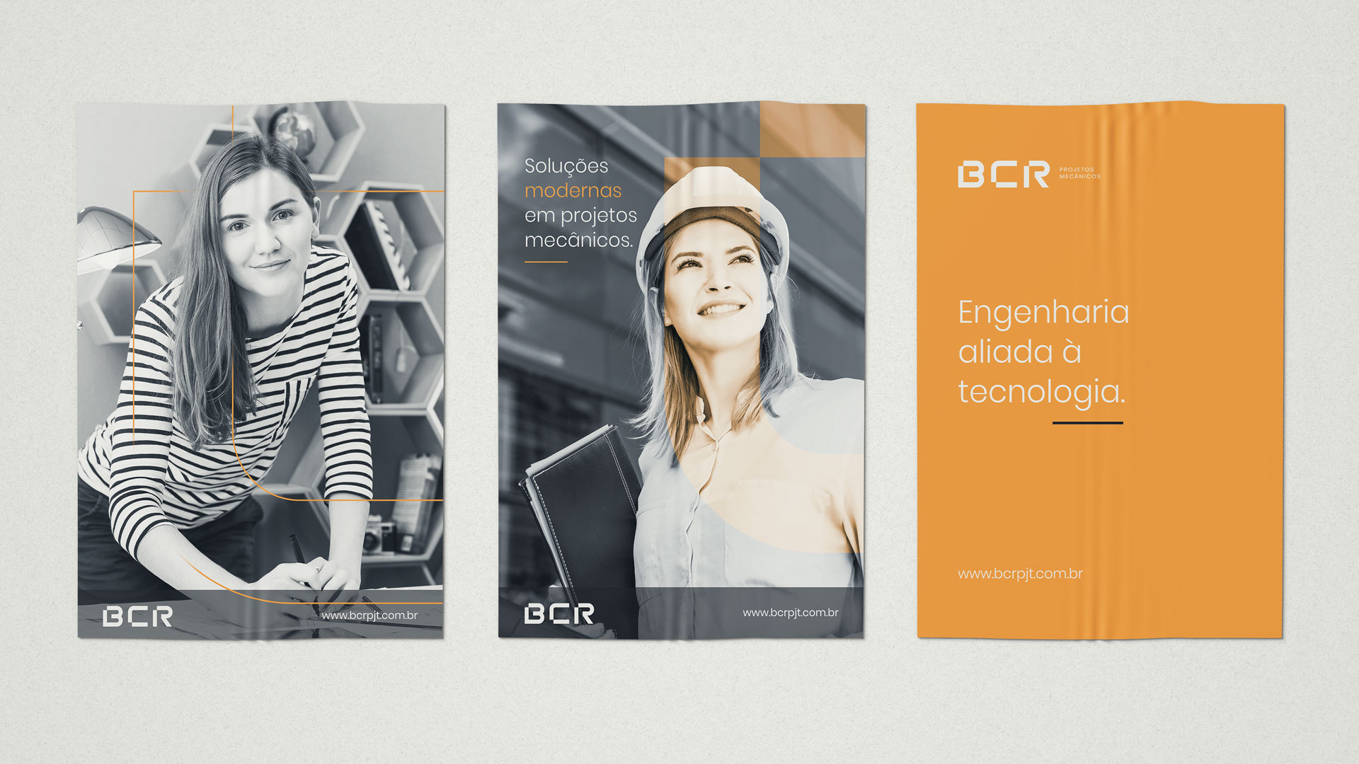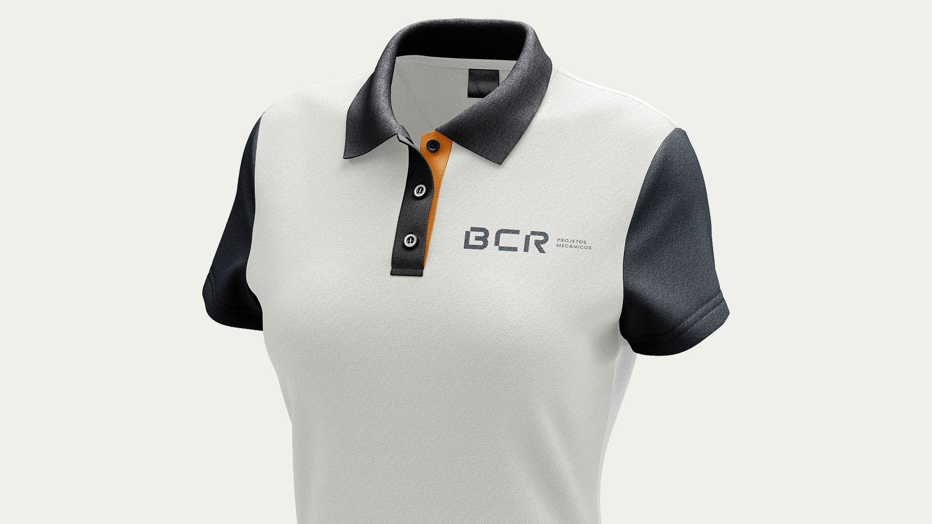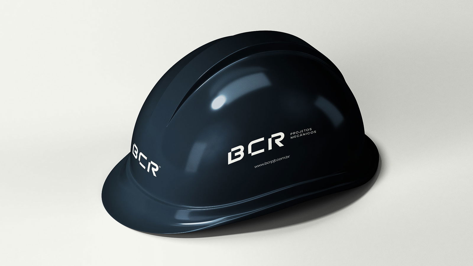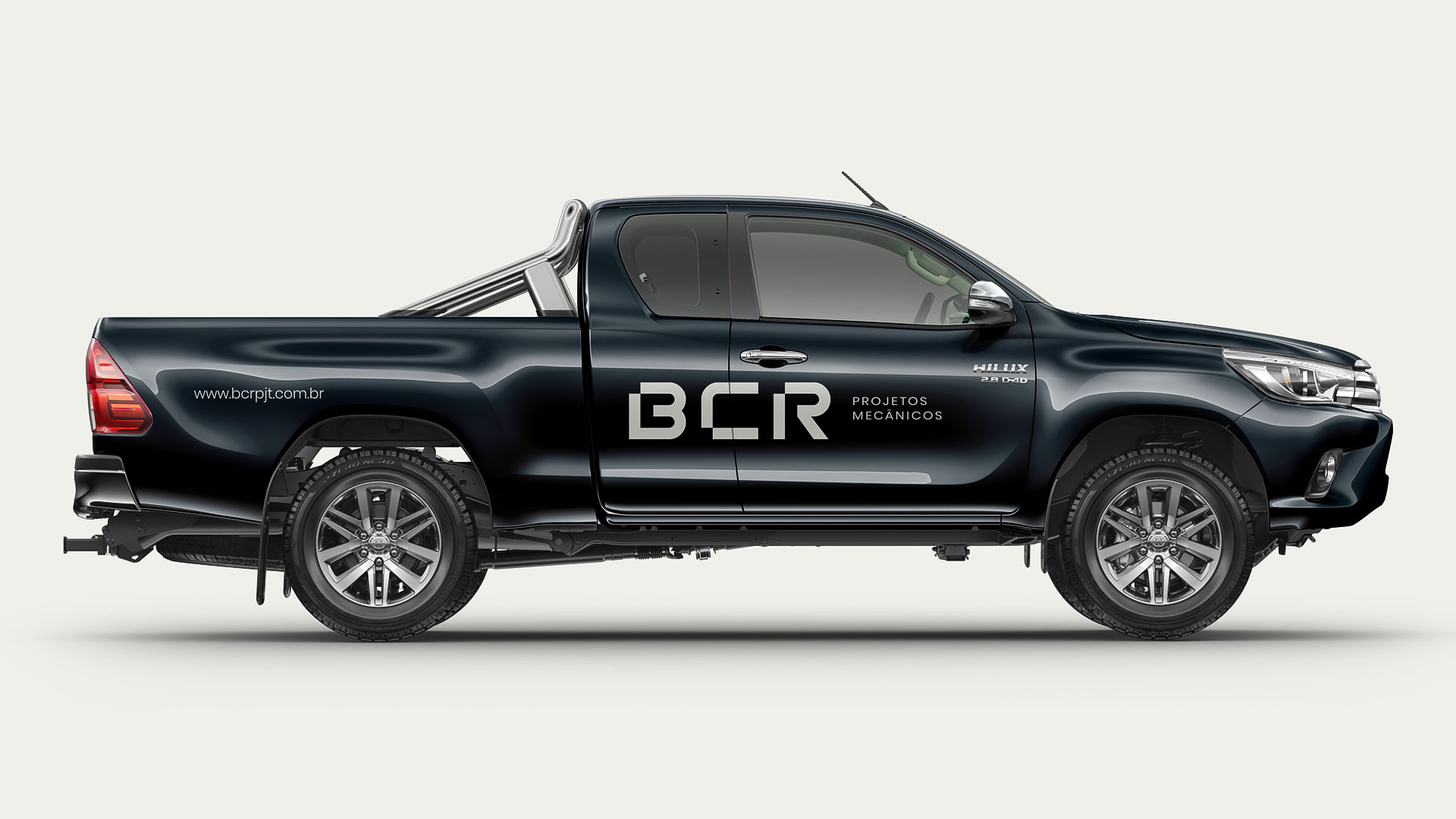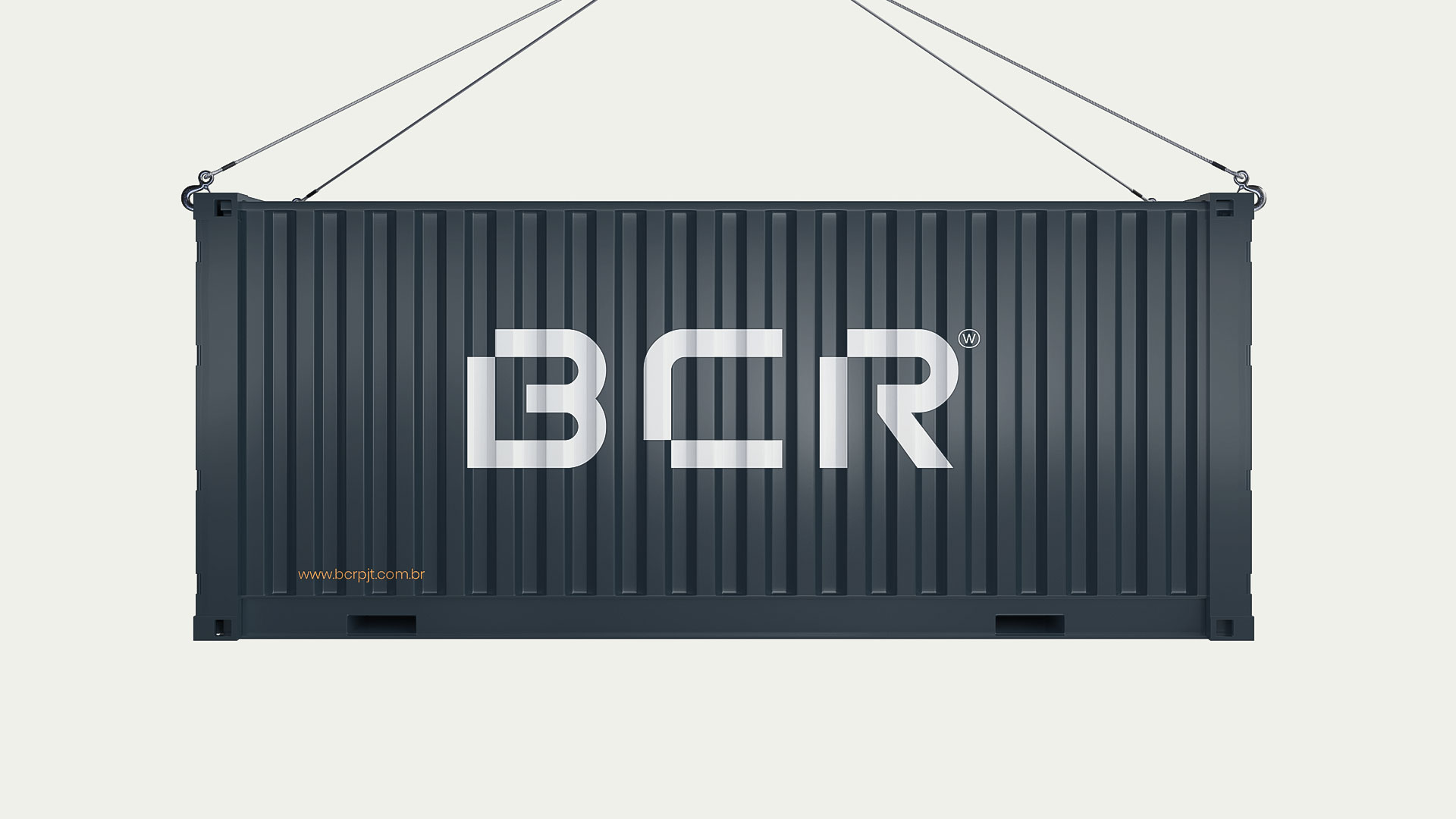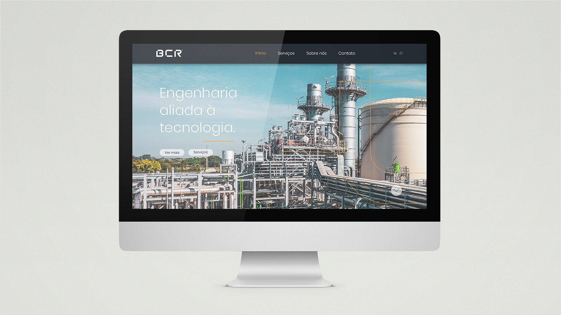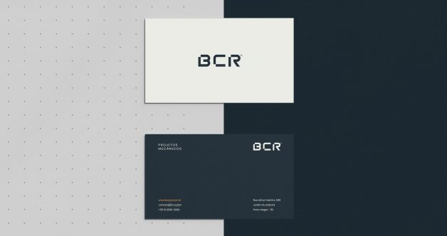
Wesley Cardozo designed these business cards for BCR, a Brazilian company that provides mechanical engineering services (projects, automation and consulting) focusing on the industrial sector.
According to Wesley, BCR is still in its initial phase in the market. It seeks to position itself and obtain recognition through visual communication and a visual identity. The company’s values are: commitment, respect and responsibility to its customers, always focusing on solving problems effectively and professionally in its projects, betting on technology as a great differential.

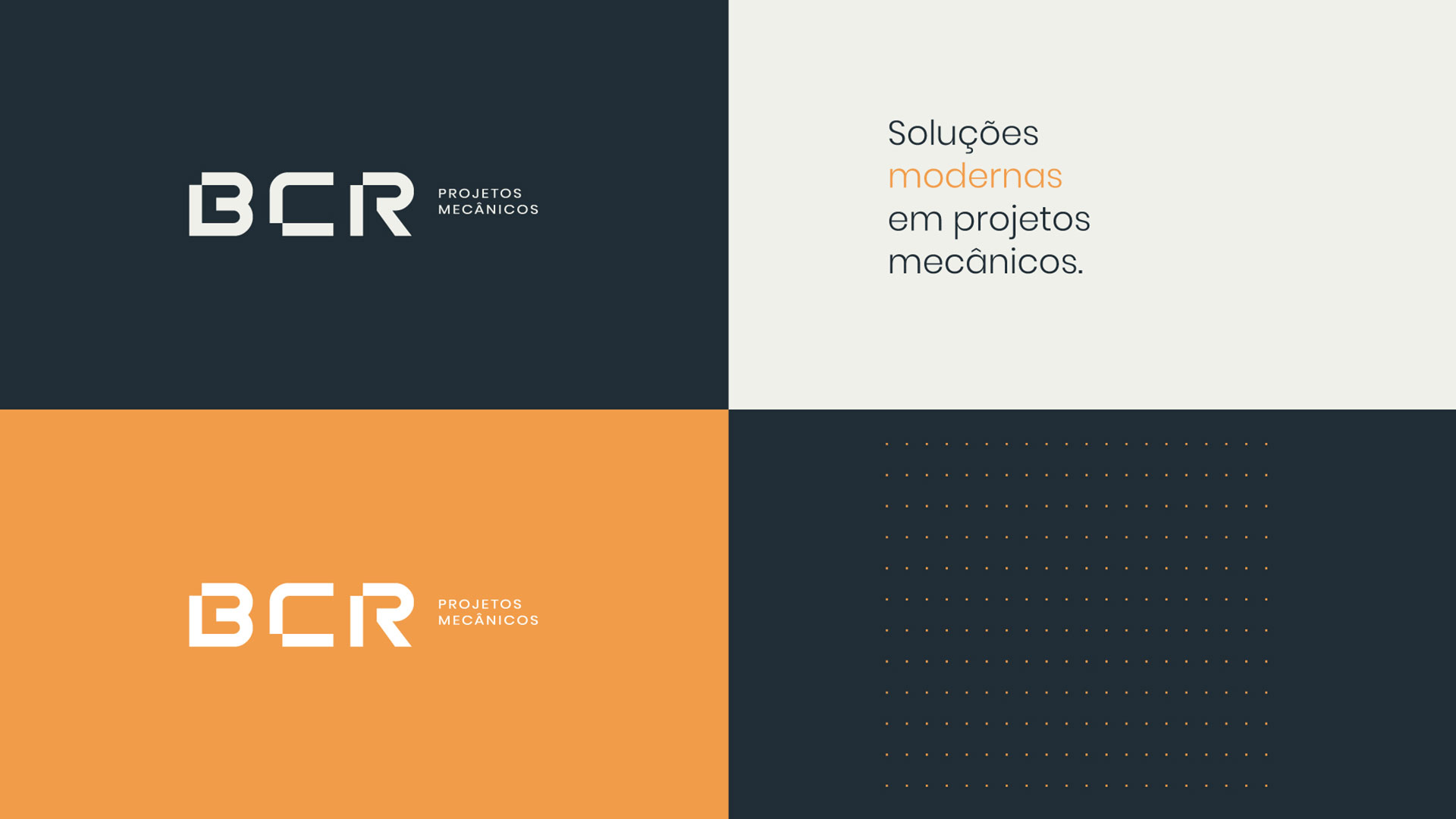
Colour Palette & Typography
The business card design embraces minimalism and uses effective typography and colours to express its brand identity.
“The colour palette was chosen to represent the characteristics of the brand, which aims to position itself as a serious, modern and bold company. For instance, dark blue helps in the representation of a serious and bold brand, while the lighter orange brings the touch of modernity,” Wesley explained.

The brand’s logotype was built from scratch while the rest of the typography used in the visual identity is Poppins.
Advertisements
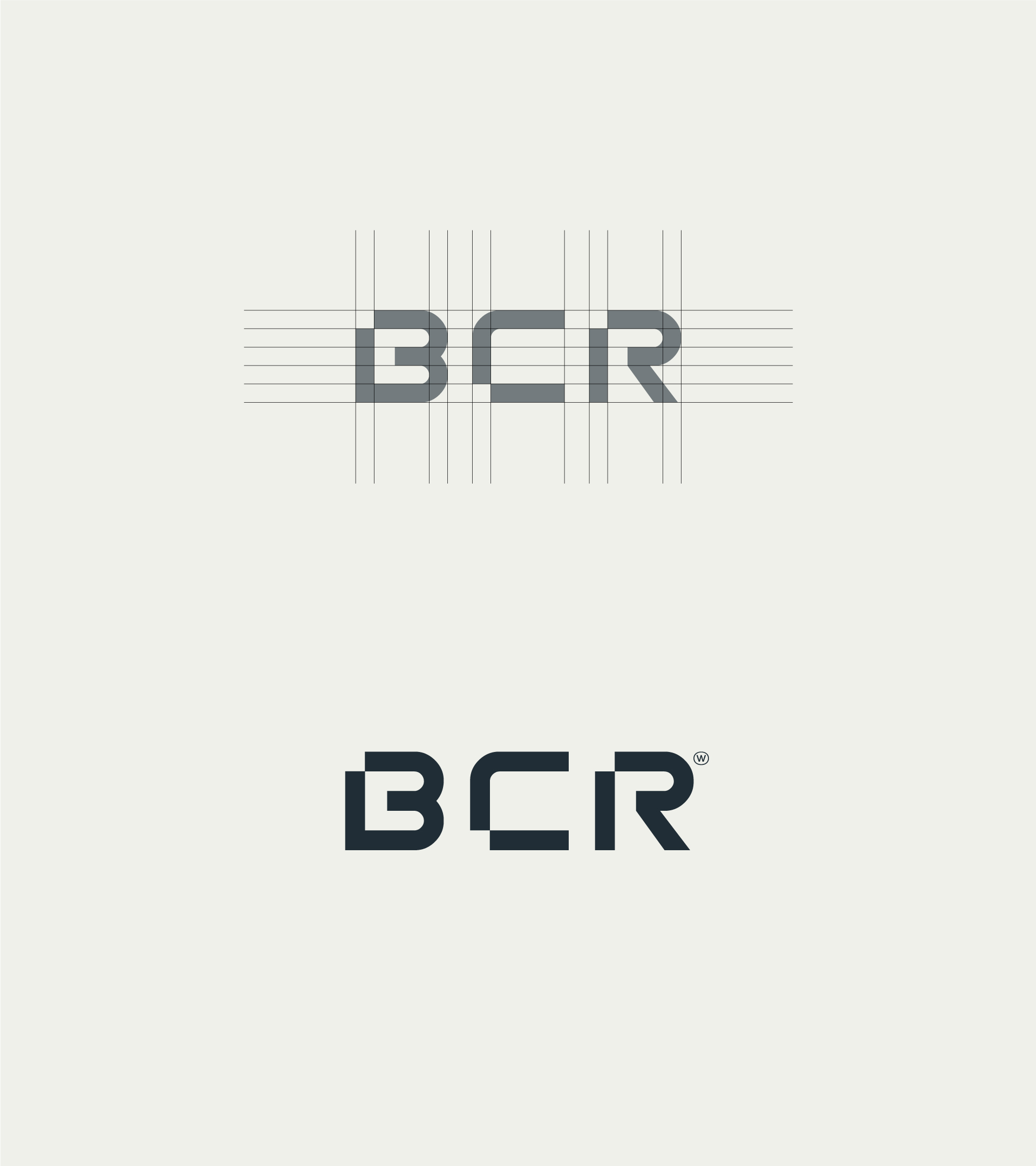
“Being the only representation of the brand (since the brand has no symbol), it was necessary for the letters ‘BCR’ to carry the whole personality of the brand, with more visually full and geometric features to represent an engineering company with serious and modern mechanics.”
“The detail of the square cut in the corners of the letters represents geometric shapes of mechanical designs.”

The client handled the card-printing themselves. Even so, Wesley suggested to use simple printing techniques for the business cards since the company’s positioning is to be professional and serious.
“However, I’d recommend to use 300g gloss couche paper with lamination ennobling, which gives a sophistication and seriousness to the printed material,” he added.


Designed by Wesley Cardozo
For BCR
